|
Quick announcement, the latest HRV4Training update includes a color-coded history view showing the daily advice for a given day. What does this tell me?HRV data has an inherently high day to day variability. This means that there can be large fluctuations between consecutive days, which is different from parameters that you might be more familiar with (for example your heart rate or your body weight). These fluctuations differ also a lot between people, which is why you should always be looking only at your own data, and there is little use in comparing with others. What are the implications? To make effective use of the data, we need to be able to determine what changes are trivial in your specific case, or just part of your normal day to day fluctuations, and what changes do matter and might require more attention or simply truly represent a positive (or negative) adaptation to training and other stressors. This is what we do in the app, and what is shown in the color-coded bars and home screen message. Typically, a green bar means that your daily score is within your normal range, which is determined using the past two months of your data. With the new color coding, you should be able to quickly see how things have been going in the recent week and what day to day changes are outside of your normal values, so that you can make adjustments when needed (e.g. trying to reduce stress or training intensity when your daily score is below your normal values). Other resourcesYou can learn more about normal values in our Ultimate Guide To Heart Rate Variability: Part 2, which is all about data analysis and interpretation or see some case studies in Part 3. We hope you'll find this improvement useful. Enjoy! 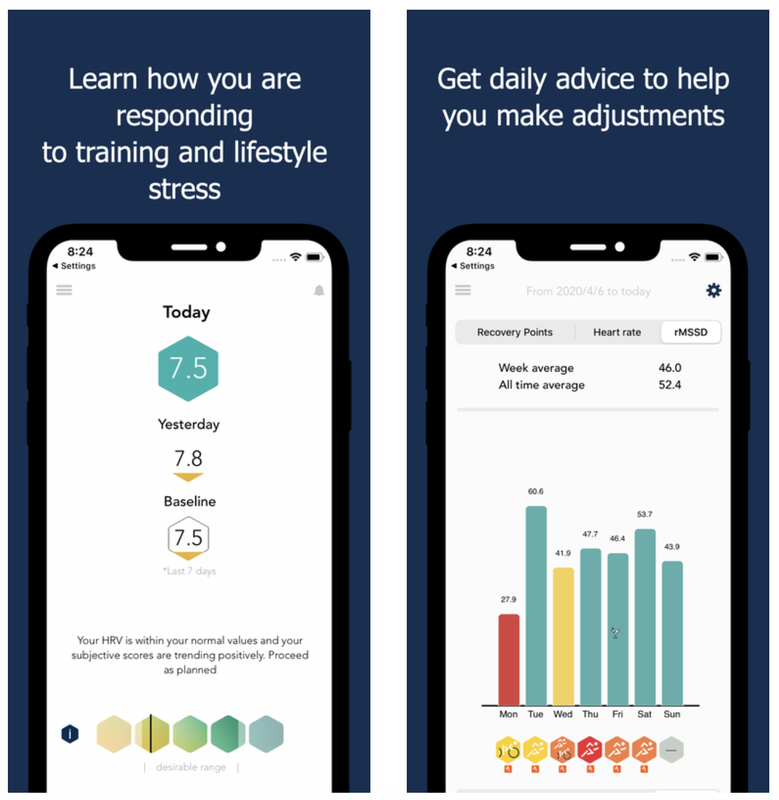 Comments are closed.
|


Register to the mailing list
and try the HRV4Training app! 
|