|
We're glad you've enjoyed the new History page and thought to bring a bit more color to the Baseline page too. Similarly to what we have discussed in the previous article, the goal of the color-coding is to make it easier to understand when there is significantly more stress on your body, or when things are trending well. Typically, a green bar means that your daily score is within your normal range, which is determined using the past two months of your data. On the other hand, a yellow score means that your daily score is below your normal values, or your subjective data is trending negatively (poor sleep, lack of motivation, high soreness and poor perceived performance make up the subjective score). A few yellow bars in a row pinpoint higher stress and the need to prioritize recovery strategies. With the new color coding, you should be able to quickly see how things have been going in the recent weeks and what day to day changes are outside of your normal values, so that you can make adjustments when needed (e.g. trying to reduce stress or training intensity when your daily score is below your normal values). See below an example of our data, showing a less than ideal two weeks with cumulating stress due to a combination of factors, starting with the lockdown and resulting self-isolation. Take care and stay safe 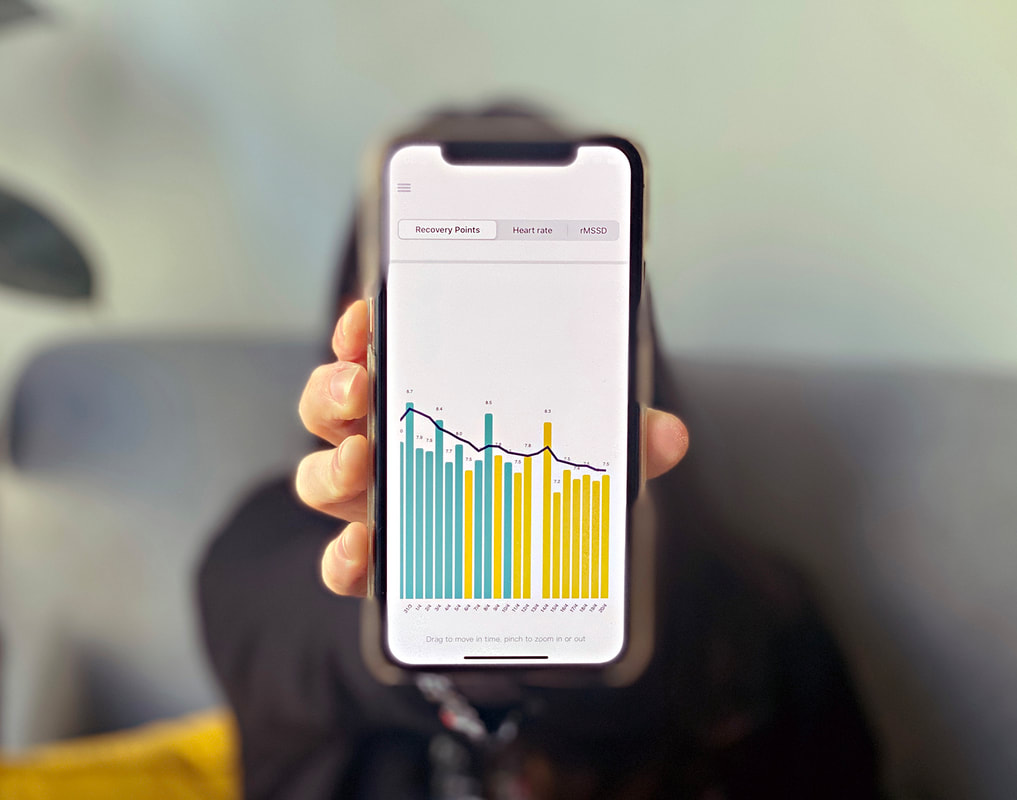 Comments are closed.
|


Register to the mailing list
and try the HRV4Training app! 
|